The Boston Bruins drafted David Pastrnak in 2014. The impact that he would come to make with line mates, Brad Marchand and Patrice Bergeron, is something in the Boston organization that fans will remember for a very long time. It’s easy to think of all that they have accomplished together, but we will dive into which one of the three players has had the biggest impact and the best statistics playing together as the top line in Boston.
Which player performs the best with this line? Join me in finding out.
library(tidyverse)
library(ggrepel)
library(waffle)
bruins <- read_csv("bruins15-21.csv")The csv file that I have here consists of the team statistics starting from the year that David Pastrnak joined the Bruins. I had the data start that year because that was the first year that all three players started playing together. This data set was pulled from hockey-reference.com.
Let’s get going.
The first statistic that I will be looking at here is the overall totals in goals and assists. This will give me an idea of which player has had the best offensive performance over the past seven seasons.
bruins %>%
  group_by(Player) %>%
  summarise(
    TotalGoals = sum(Goals),
    TotalAssists = sum(Assists)
  ) %>% pivot_longer(cols=-Player, names_to="Type", values_to="Total") %>%
  filter(Player == "Patrice Bergeron" | Player == "Brad Marchand" | Player == "David Pastrnak") -> bigthree
In order to create the chart that I am looking for, I need to start by using the summarise() function to add up the total goals and total assists for each player. I filtered out Patrice Bergeron, Brad Marchand, and David Pastrnak because they are the three players that we are looking at.
ggplot(bigthree, aes(x=reorder(Player, Total), weight=Total, fill=Type)) +
geom_bar() +
coord_flip() +
labs(x="Player", y="Career Points",
title="Brad Marchand may look funky, but his numbers don't lie",
subtitle="Marchand leads Boston's Big Three by nearly one hundred points.",
caption="Source: hockey-reference | By Jeffrey Noh") +
theme_minimal() +
theme(
plot.title = element_text(size = 12, face = "bold"),
axis.title = element_text(size = 8),
plot.subtitle = element_text(size=10),
panel.grid.minor = element_blank()
)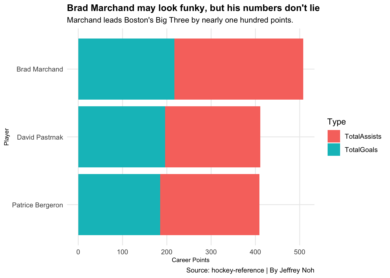 Here we see that Brad Marchand stomps on David Pastrnak and Patrice Bergeron in the total points race. Marchand leads by over 100 points. Something that caught my attention was the number of assists that Marchand has collected. The three players are relatively close in goals scored, but the number of assists stand out in Marchand’s favor. This chart is something to keep in mind as we still have plenty of other data to look at in order to compare the players.
It is important for teams to have good numbers on the power play. Having more players on the ice gives the team an advantage. However, penalty kills are different. On penalty kills, goals are rare, but that doesn’t mean there aren’t any goals at all. Let’s have a look at the power play and penalty kill numbers.
To do so, we need to start by calculating the total number of power play goals and assists. We are also going to calculate the penalty kill numbers as well. In order to get this done, I used summarise() to add up the number of goals and assists. You’ll notice that I added “penalties in minutes.” I did this because I wanted to see who spends the most time in the penalty box. After these steps, I created a new data frame called, “bruinspp.”
bruins %>%
  group_by(Player) %>%
  summarise(
    TotalPPGoals = sum(PPGoals),
    TotalPPAssists = sum(PPAssists),
    TotalSHGoals = sum(SHGoals),
    TotalSHAssists = sum(SHAssists),
    TotalPIM = sum(PIM)) %>%
      mutate(
        Powerplaypoints = TotalPPGoals+TotalPPAssists,
        Shorthandedpoints = TotalSHGoals+TotalSHAssists
      ) -> bruinspp
bigthree <- bruinspp %>%
filter(Player == "Patrice Bergeron" | Player == "Brad Marchand" | Player == "David Pastrnak")Now, to visualise this data, I will be using a bubble chart. In this bubble chart, I have Bergeron, Marchand, and Pastrnak highlighted in yellow. On the x-axis, I have the power play total points and, on the y-axis, I have the shorthanded/penalty kill total points. For reference, I have added in all the Bruin players that have played within the seven years into our data. Additionally, I have added red lines which represent the average shorthanded and power play points.
ggplot() +
geom_point(
data = bruinspp,
aes(Powerplaypoints, y=Shorthandedpoints, size=TotalPIM),
color="#000000",
alpha=.3) +
scale_size(range = c(3,8), name="Penalties in Minutes") +
geom_point(
data = bigthree,
aes(Powerplaypoints, y=Shorthandedpoints, size=TotalPIM),
color="#FCB60C") +
geom_vline(xintercept = 9.351852, color="red") +
geom_hline(yintercept = 1.083333, color="red") +
geom_text_repel(
data = bigthree,
aes(x=Powerplaypoints, y=Shorthandedpoints, label=Player),
size=2.5
) +
geom_text(aes(y=2.8, x=60,
label="Avg. Short Handed Points"),
color="black",
size=2.5) +
geom_text(aes(y=15, x=29,
label="Avg. Power Play Points"),
color="black",
size=2.5) +
labs(title="Marchand strong short handed and on power plays",
subtitle="Brad Marchand spends plenty of time in the penalty box, but when on the ice, the production is there.", caption="Source: hockey-reference | By Jeffrey Noh",
x="Power Play Points",
y="Short Handed Points",
size=4) +
theme_minimal() +
theme(
plot.title = element_text(size = 16, face = "bold"),
axis.title = element_text(size = 8),
plot.subtitle = element_text(size=10),
panel.grid.minor = element_blank()
)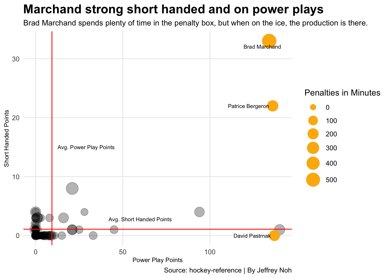 We see in our chart that our three players stand out in a big way. Both Marchand and Bergeron are well above both lines that mark the averages. Although Pastrnak is below the average shorthanded points line, he has a very slight lead when it comes to power play points.
Another fact to note that we see in this chart is that Brad Marchand has spent an overwhelming amount of time in the penalty box. That doesn’t seem to hurt his numbers too much as he leads in shorthanded points and is just behind Bergeron in power play points.
We see in our chart that our three players stand out in a big way. Both Marchand and Bergeron are well above both lines that mark the averages. Although Pastrnak is below the average shorthanded points line, he has a very slight lead when it comes to power play points.
Another fact to note that we see in this chart is that Brad Marchand has spent an overwhelming amount of time in the penalty box. That doesn’t seem to hurt his numbers too much as he leads in shorthanded points and is just behind Bergeron in power play points.
bruinspp %>%
  ungroup() %>%
  summarise(
    pp = mean(Powerplaypoints),
    sh = mean(Shorthandedpoints)
  )
## # A tibble: 1 x 2
## pp sh
## <dbl> <dbl>
## 1 9.35 1.08At this point, it seems as though Brad Marchand will be named the best player out of Boston’s Big Three. We all know that goals and assists have a huge impact on the outcome of hockey games, but they aren’t the only factors that go into being a respected player on a team. That being said, let’s take a look into the physical play.
To start, I will be calculating the total shot blocks and total hits produced by our three players.
physical <- bruins %>%
  group_by(Player) %>%
  summarise(
    Totalblocks = sum(BLK),
    Totalhits = sum(HIT)
  ) %>%
  filter(Player == "Patrice Bergeron" | Player == "Brad Marchand" | Player == "David Pastrnak")
To show the difference of blocked shots and hits between Bergeron, Marchand, and Pastrnak, I will be using a waffle chart.
BM <- c("Blocked Shots"=170, "Hits"=373, 160)
DP <- c("Blocked Shots"=146, "Hits"=327, 230)
PB <- c("Blocked Shots"=339, "Hits"=364)
This chart will show the number of hits and blocks that each player was credited with. With each square representing five plays, we will be able to see who has the biggest physical impact.
iron(
waffle(PB/5,
rows = 8,
xlab = "1 square = 5 Plays",
colors = c("#fcb514", "black", "white")) +
labs(title="Boston's Big Three: Physical Presence",
subtitle="Patrice Bergeron does the best job at giving up his body for his team.") +
theme(
plot.title = element_text(size = 18, face = "bold"),
axis.title = element_text(size = 10),
axis.title.y = element_blank()
),
waffle(BM/5,
rows = 8,
title = "Brad Marchand",
xlab = "1 square = 5 Plays",
colors = c("#fcb514", "black", "white")
),
waffle(DP/5,
rows = 8,
title = "David Pastrnak",
xlab = "1 square = 5 Plays",
colors = c("#fcb514", "black", "white")) +
labs(caption="Source: hockey-reference | Graphic by Jeffrey Noh")
)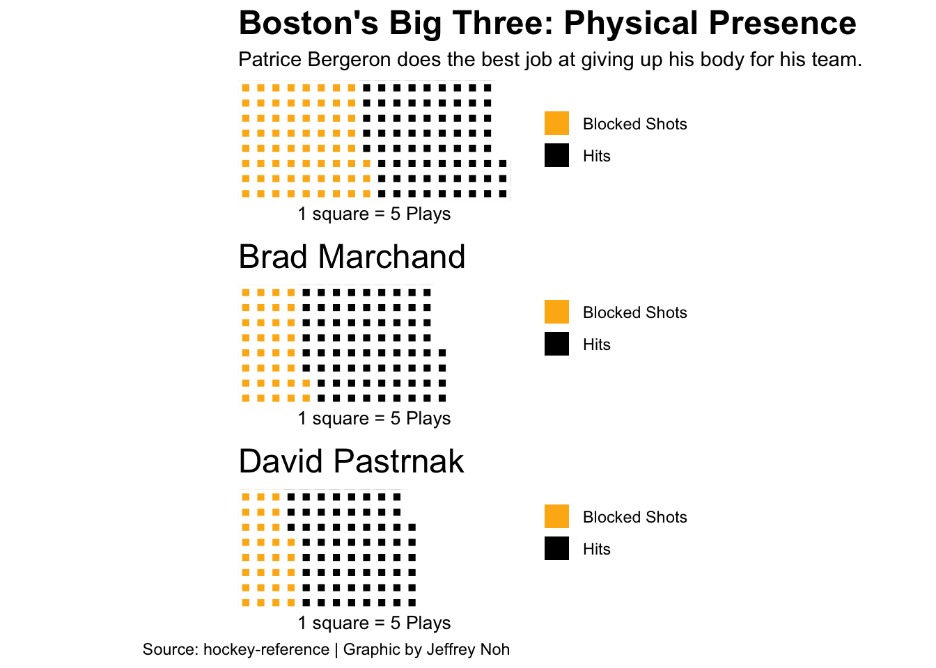 This chart gives us a great visual of the difference in blocked shots and hits.
All three players have a similar amount of hits, but blocked shots is what I want to look at.
The reason why I personally believe that blocked shots are more important is because blocked shots take away the opposing teams’ chances of scoring a goal because the shots don’t get through. As we see, Patrice Bergeron has done the best job at keeping the shots from getting through while Brad Marchand has a one square advantage when it comes to hits.
This chart gives us a great visual of the difference in blocked shots and hits.
All three players have a similar amount of hits, but blocked shots is what I want to look at.
The reason why I personally believe that blocked shots are more important is because blocked shots take away the opposing teams’ chances of scoring a goal because the shots don’t get through. As we see, Patrice Bergeron has done the best job at keeping the shots from getting through while Brad Marchand has a one square advantage when it comes to hits.
After diving into the data and visualizing it, this line has generated a great amount of excitement for Bruin fans. When it comes down to who contributes the most, I would have to go with Brad Marchand. The reasoning behind this would be because Marchand really stood out from Pastrnak and Bergeron in the first two charts. Although he wasn’t the top guy for the third chart, he did lead in hits showing that he is a great physical player. Looking at overall performace, Brad Marchand is the player that is the most well rounded.