Picture this: you walk into your favorite NHL teams’ home ice rink. What is the first thing that you see? Probably the giant screens hanging above center ice known as a jumbotron. You examine the opponents’ statistics. As your eyes make their way down the list, you see a small box labeled “Shots.”
Most of the time you would overlook it and pay little to no attention to it, but when you look past the fact that it is just a number on a screen, and dig into the statistics, the number of shots is a very interesting category.
You’re probably thinking, “the more shots a team takes means the better chance of scoring a goal;” and you’re not wrong. So, join me in digging deeper into these numbers.
I’ll show you why this statistic is so fascinating.
library(tidyverse)## ── Attaching packages ─────────────────────────────────────── tidyverse 1.3.0 ──## ✓ ggplot2 3.3.3 ✓ purrr 0.3.4
## ✓ tibble 3.0.5 ✓ dplyr 1.0.3
## ✓ tidyr 1.1.2 ✓ stringr 1.4.0
## ✓ readr 1.4.0 ✓ forcats 0.5.0## ── Conflicts ────────────────────────────────────────── tidyverse_conflicts() ──
## x dplyr::filter() masks stats::filter()
## x dplyr::lag() masks stats::lag()library(ggalt)## Registered S3 methods overwritten by 'ggalt':
## method from
## grid.draw.absoluteGrob ggplot2
## grobHeight.absoluteGrob ggplot2
## grobWidth.absoluteGrob ggplot2
## grobX.absoluteGrob ggplot2
## grobY.absoluteGrob ggplot2library(ggrepel)
library(waffle)
library(kableExtra)##
## Attaching package: 'kableExtra'## The following object is masked from 'package:dplyr':
##
## group_rowshockey <- read_csv("hockeylogs.csv")##
## ── Column specification ────────────────────────────────────────────────────────
## cols(
## .default = col_double(),
## Team = col_character()
## )
## ℹ Use `spec()` for the full column specifications.The data set that I will be using consists of the past four NHL season statistics along with this year’s ongoing season. This data set comes from hockey-reference.com.
Let’s get started.
The first thing that we need in order to get started is to find the total number of shots and wins that were recorded throughout the last four seasons. The reason that I am not using this season is because teams have only played 34 games, which would give us results that do not accurately represent the worst teams.
shottotal <- hockey %>%
  filter(Season != 2021) %>%
  group_by(Team, Season) %>%
  summarise(
  totalshots = sum(S),
  Wins = sum(W))
## `summarise()` has grouped output by 'Team'. You can override using the `.groups` argument.Here I am looking at the correlation between the team with the lowest shots taken during a season and the fewest number of wins at the conclusion of that season.
In order to do that, I am going to create a dataframe that has less than 2300 total shots on goal. I chose 2300 because when we look at our data, we can see that 2300 is about the average number of shots taken by teams. I am also going to create a dataframe that exposes a team with less than 25 wins.
lowshots <- shottotal %>% filter(totalshots < 2300)
losses <- shottotal %>% filter(Wins < 25)
What team truly is the worst team in the recent past? I will be using a scatterplot to highlight the teams who have struggled.
Here we see those teams.
ggplot() + geom_point(data=shottotal, aes(x=Wins, y=totalshots),
        color="grey") +
  geom_point(data=lowshots,
        aes(x=Wins, y=totalshots),
        color="blue") +
  geom_point(data=losses,
        aes(x=Wins, y=totalshots),
        color="red") +
  geom_text_repel(data=losses, aes(x=Wins, y=totalshots, label=Team), size = 3) +
  geom_encircle(data=losses,
        aes(x=Wins, y=totalshots), s_shape=.1, expand=.05, colour="red") +
  geom_text(aes(x=25, y=1725, label="Least amount of shots")) +
  labs(title="The Detroit Red Wings hop on the struggle bus",
       subtitle="They took the fewest number of shots leading to less than 20 wins.",
       x="Team Wins",
       y="Total Shots",
       caption="Source: hockey-reference | By Jeffrey Noh") +
  theme_minimal() +
  theme(
  plot.title = element_text(size=14, face = "bold"),
  axis.title = element_text(size = 8),
  plot.subtitle = element_text(size = 10),
panel.grid.minor = element_blank()) 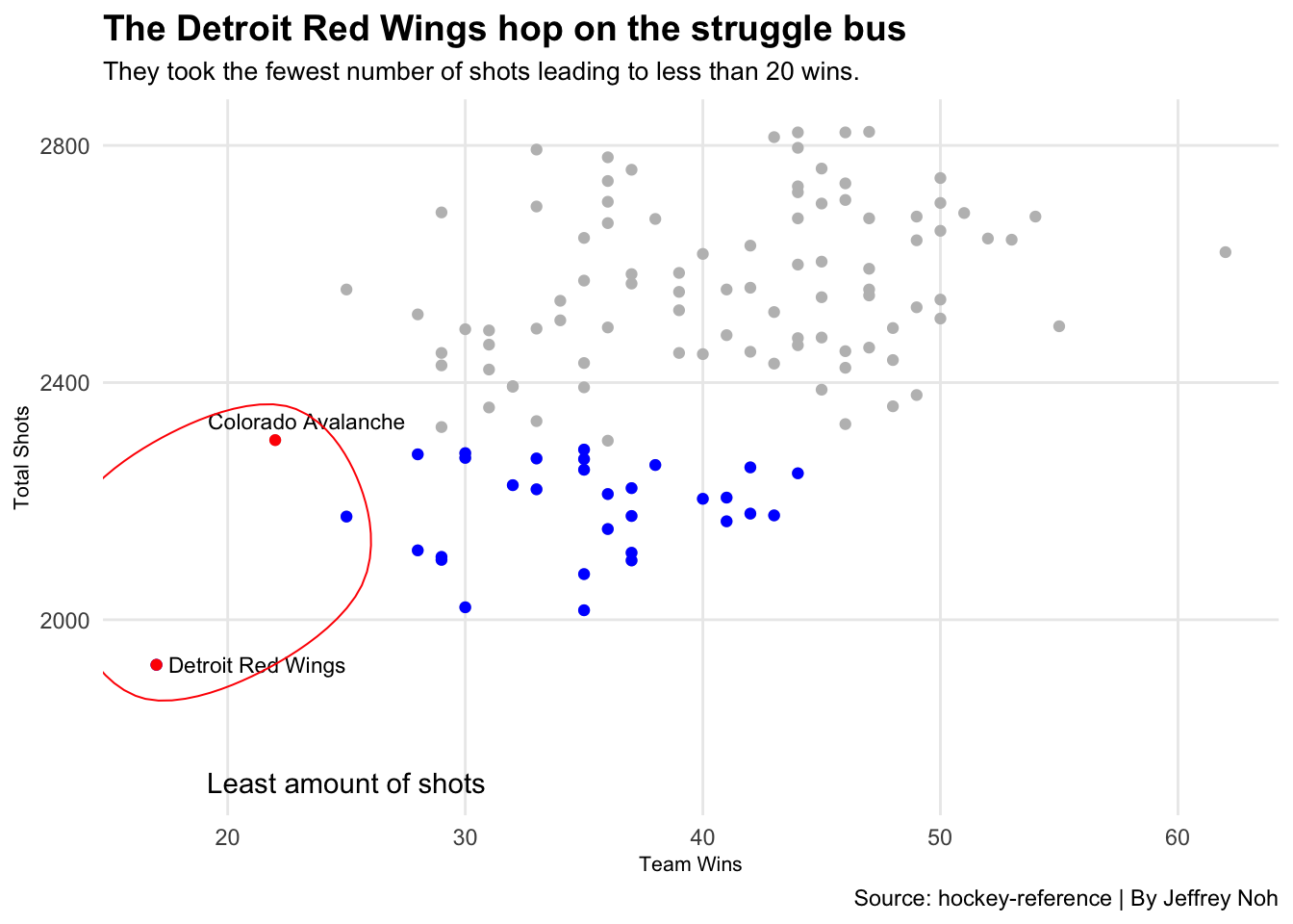
Colorado and Detroit are the two teams that we have circled in our chart; here we find an interesting trend. Although Colorado had a significantly greater amount of shots, they still ended with less than 25 wins. Let’s take a look at the correlation of this chart.
We see that the amount of shots doesn’t directly influence whether or not a team wins. However, we do see that a majority of teams that have taken more shots tend to win more often.
Let’s have a look at the 2019 season and compare the Stanley Cup Champions to the worst performing team. How does the team that won the most sought after trophy in hockey compare to the team at the opposite end of the list?
season <- hockey %>% filter(Season == 2019) To get the data that I need, I start by creating dataframes that give me the stats for the Tampa Bay Lightning and the Los Angeles Kings.
tampa <- season %>% filter(Team == "Tampa Bay Lightning")
la <- season %>% filter(Team == "Los Angeles Kings")
tbl <- c("Shots"=2620, "Goals"=319, 0)
lak <- c("Shots"=2358, "Goals"=199, 382)To show the difference between the two teams, I will be using a waffle chart. I have created this chart to represent the teams by their team colors.
iron(
waffle(
tbl/50,
rows = 5,
colors = c("#002868", "grey", "white")) +
labs(title="TB Lightning vs. LA Kings Shot to Goal Ratio", subtitle="Tampa Bay thrived in getting shots on net while LA struggled to do so.") +
theme(
plot.title = element_text(size = 16, face = "bold"),
axis.title = element_text(size = 10),
axis.title.y = element_blank()
),
waffle(
lak/50,
rows = 5,
xlab="1 square = 50 shots",
colors = c("black", "grey", "white")) +
labs(caption="Source: hockey-reference.com | Graphic by Jeffrey Noh")
)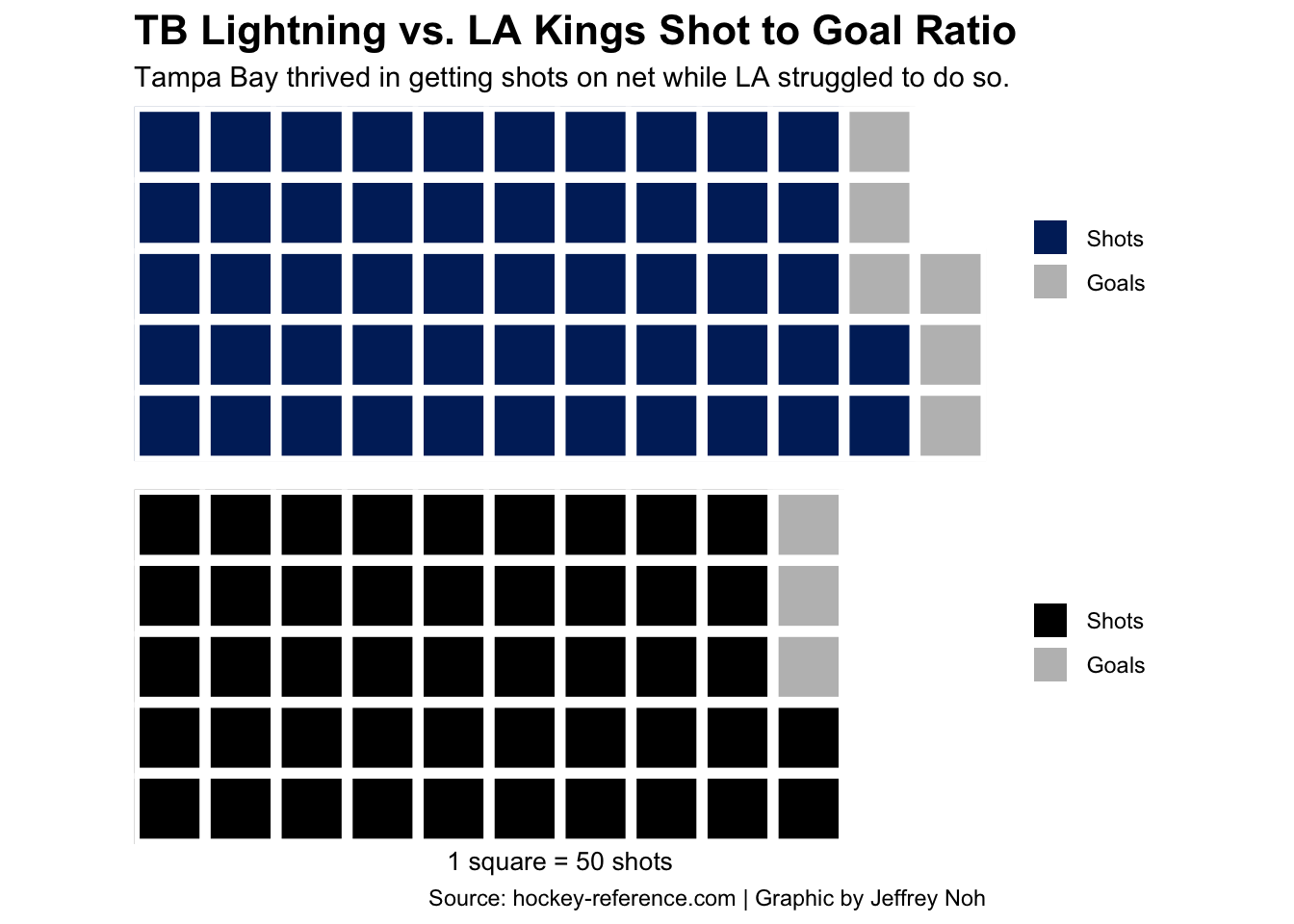 With one square representing 50 shots on net, we clearly see that the Lightning overpowered the Kings outnumbering them by eight squares in which three of them were goals.
So what exactly does this chart show? It’s obvious that we see the differential in shots that the two teams took, but digging deeper, it gives us an idea of the opportunity for shots on goal.
Since the number of shots and wins have a positive correlation, we look into which teams had the most success taking all these shots throughout a season. That drives the question, what teams were the most efficient in taking shots and scoring goals?
To visualize the efficiency in shots taken by teams in the 2017-2020 seasons, I will be using a bubble chart.
To start, I will be calculating the total shots, goals, games, and wins. After we get the labels that we need, we will use the function mutate() in order to get our “per game” numbers.
hockey %>%
  group_by(Team, Season) %>%
  summarise(
    TotalShots = sum(S),
    TotalGoals = sum(Teamgoals),
    TotalGames = sum(GP),
    TotalWins = sum(W)) %>%
  mutate(
    GPG = TotalGoals/TotalGames,
    SPG = TotalShots/TotalGames
  ) -> totalpergame
## `summarise()` has grouped output by 'Team'. You can override using the `.groups` argument.topteams <- totalpergame %>% filter(TotalWins > 53)totalpergame %>%
ungroup() %>%
summarise(
goals = mean(GPG),
shots = mean(SPG)
)## # A tibble: 1 x 2
## goals shots
## <dbl> <dbl>
## 1 2.90 31.0After getting the correct numbers, and filtering out teams with more than 53 wins, I am able to use ggplot() and run my code.
ggplot() +
  geom_point(
    data=totalpergame,
    aes(x=GPG, y=SPG, size=TotalWins),
    color="grey",
    alpha=.5) +
  geom_point(
    data=topteams,
    aes(x=GPG, y=SPG, size=TotalWins),
    color="red") +
  geom_vline(xintercept = 2.900184,
             color="blue") +
  geom_hline(yintercept = 31.00658,
             color="blue") +
  geom_text_repel(
    data = topteams,
    aes(x=GPG, y=SPG, label=Team), size = 3) +
  labs(title="Tampa Bay: The Most Efficient Shooting Team?", subtitle="The Lightning have had two 53+ win seasons taking just above the average number of shots",
caption="Source: hockey-reference | By Jeffrey Noh",
x="Goals Per Game", y="Shots Per Game")  +
  theme_minimal() +
  theme(
    plot.title = element_text(size = 16, face = "bold"),
    axis.title = element_text(size = 7),
    plot.subtitle = element_text(size=10),
    panel.grid.minor = element_blank()
    )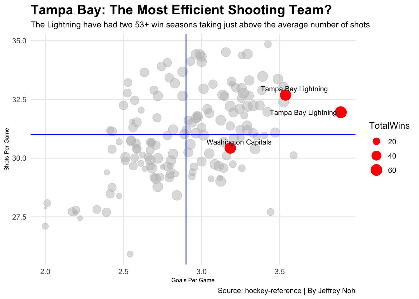
Here we see that the Tampa Bay Lightning has had the best shots on goal to goals scored ratio twice and the Washington Capitals once. An interesting aspect that we can look at is that the top three teams were either just above or just below the average shots per game. If you follow hockey, you probably know that Tampa Bay has been a top tier team throughout the past four years. That being said, does it surprise you that the Lightning are on the chart twice?
Shots are obviously very important in the game of hockey. However, they are not just numbers that we see on the jumbotron. After examining all of these statistics, we can only wonder… will Tampa Bay continue with their efficient shooting in the future?