We are looking into the worst performances by a team last football season. In order to do so we need to read out .csv file.
library(tidyverse)## ── Attaching packages ─────────────────────────────────────── tidyverse 1.3.0 ──## ✓ ggplot2 3.3.3 ✓ purrr 0.3.4
## ✓ tibble 3.0.5 ✓ dplyr 1.0.3
## ✓ tidyr 1.1.2 ✓ stringr 1.4.0
## ✓ readr 1.4.0 ✓ forcats 0.5.0## ── Conflicts ────────────────────────────────────────── tidyverse_conflicts() ──
## x dplyr::filter() masks stats::filter()
## x dplyr::lag() masks stats::lag()Here we have our .csv file in which we will be renaming it to “badfootball.”
badfootball <- read_csv("badfootballlogs19.csv")##
## ── Column specification ────────────────────────────────────────────────────────
## cols(
## .default = col_double(),
## Date = col_character(),
## HomeAway = col_character(),
## Opponent = col_character(),
## Result = col_character(),
## TeamFull = col_character(),
## TeamURL = col_character(),
## Team = col_character(),
## Conference = col_character()
## )
## ℹ Use `spec()` for the full column specifications.We have a problem… You might be wondering “what’s the problem?” The problem is our data. The “Results” column is not the way we want it. We want it to be more detailed. So we will change “Result” to “Outcome” and “Score”. We will also want “Score” to be more descriptive so we will branch it out and have “Team Score” and “Opponent Score.”
badfootball %>% separate(Result, into=c("Outcome", "Score"), sep=" ")  %>%
mutate(Score = gsub("(", "", Score, fixed=TRUE)) %>%
 mutate(Score = gsub(")", "", Score, fixed=TRUE)) %>%
  separate(Score, into=c("TeamScore", "OpponentScore"), sep="-") %>% mutate(TeamScore = as.numeric(TeamScore), OpponentScore = as.numeric(OpponentScore)) -> football
Now that we have clean data, we can filter out and expose those games that had a differential in points bigger than 65 points.
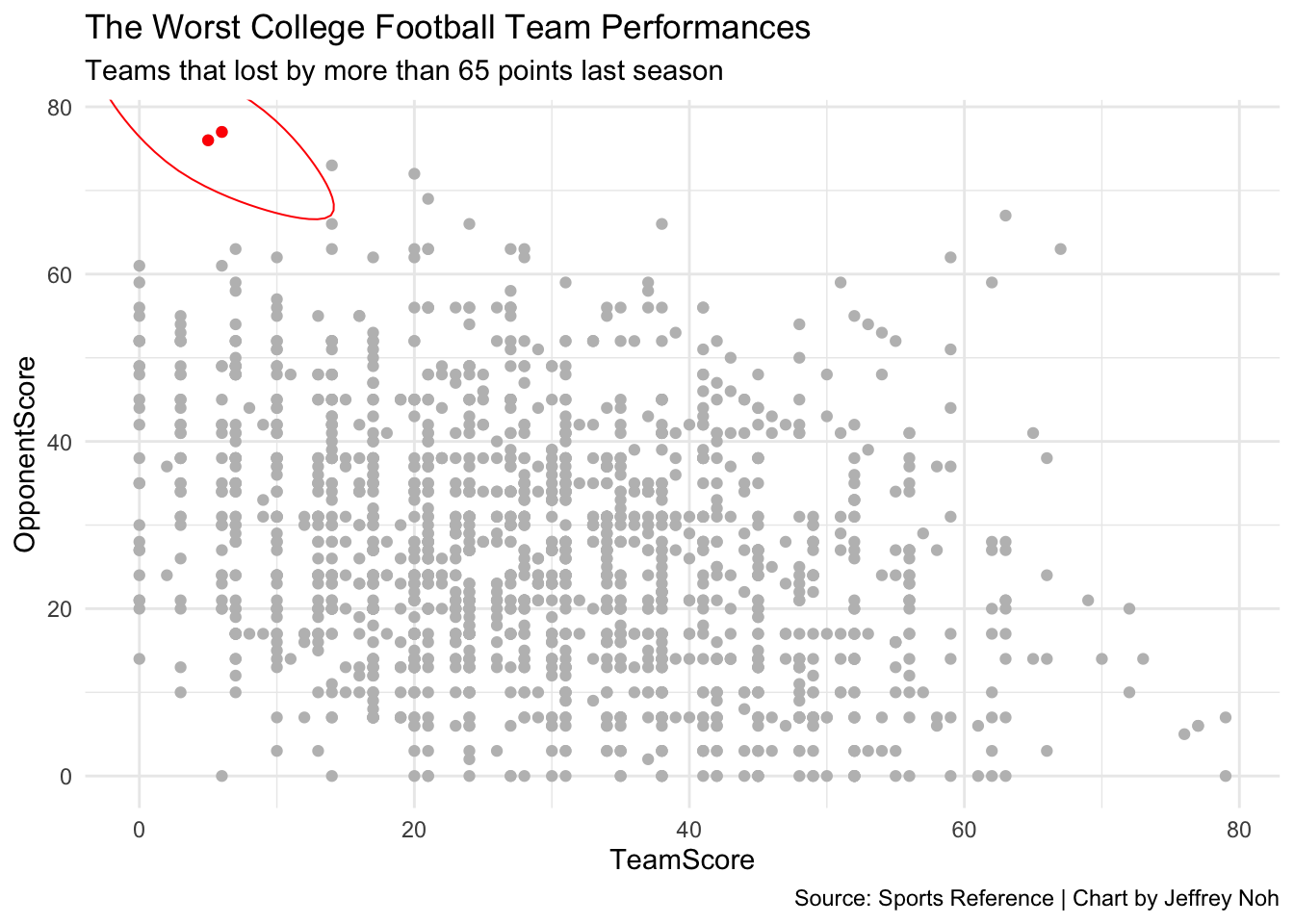
football %>% mutate(Differential = (OpponentScore - TeamScore)) %>% filter(Differential > 65) -> worstgamesWe now have clean data along with the teams that had horrible games. So let’s chart all games and expose those two awful games in red.
ggplot() + geom_point(data=football, aes(x=TeamScore, y=OpponentScore), color="grey") +
geom_point(data=worstgames, aes(x=TeamScore, y=OpponentScore), color="red")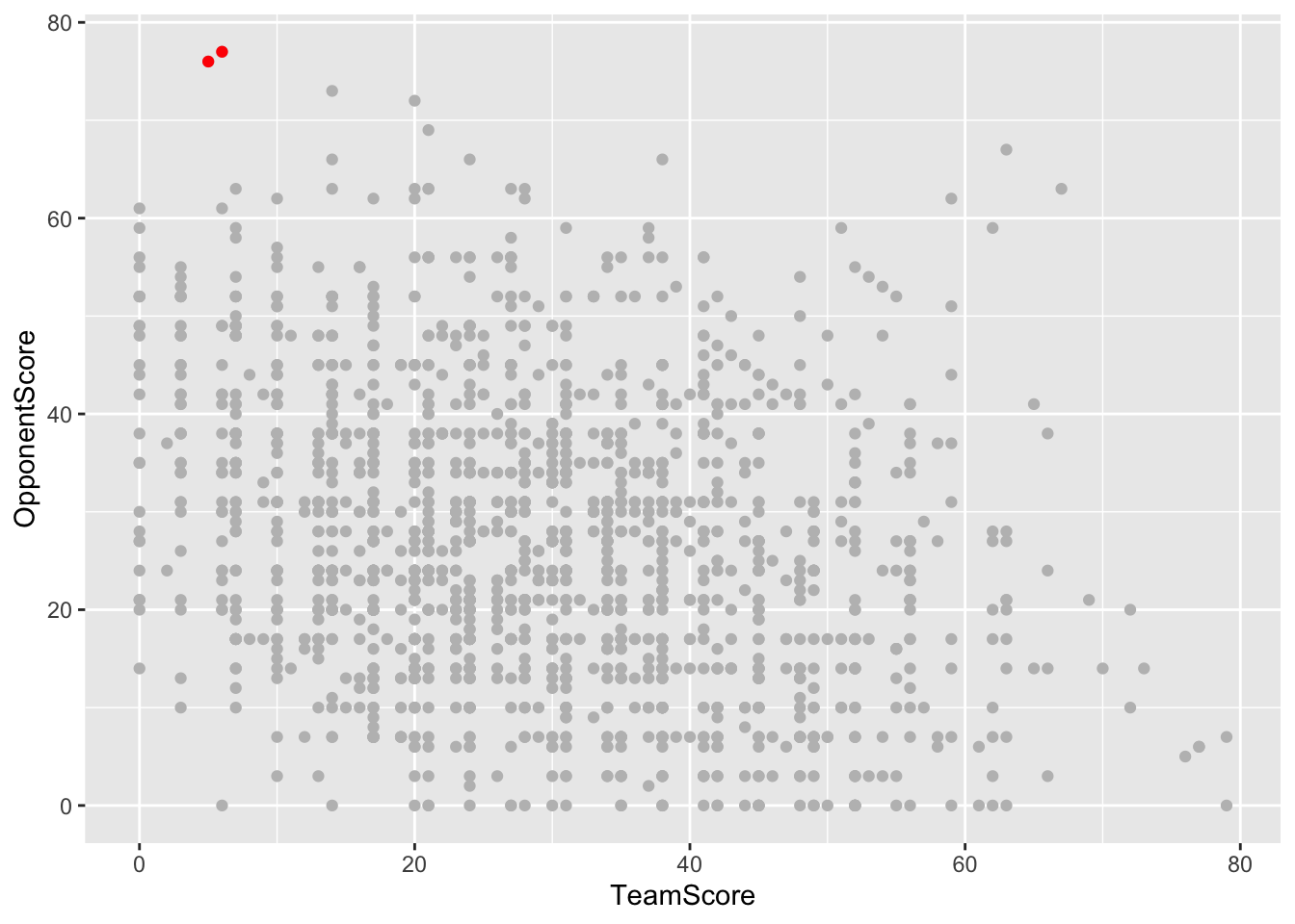 Now in order to really expose the two teams, we need to encircle them. We use the ggalt library in order to do so.
library(ggalt)## Registered S3 methods overwritten by 'ggalt':
## method from
## grid.draw.absoluteGrob ggplot2
## grobHeight.absoluteGrob ggplot2
## grobWidth.absoluteGrob ggplot2
## grobX.absoluteGrob ggplot2
## grobY.absoluteGrob ggplot2Here we have the code for the final table. The table shows the unfortunate games in red. We have the Opponent Score on the y axis and the Team Score on the x axis. We give credit to Sports Reference for the data and I take credit for the graph.
ggplot() + geom_point(data=football, aes(x=TeamScore, y=OpponentScore), color="grey") +
  geom_point(data=worstgames, aes(x=TeamScore, y=OpponentScore), color="red") +
  geom_encircle(data=worstgames, aes(x=TeamScore, y=OpponentScore), s_shape=.1, expand=.06, colour="red") +
  labs(title="The Worst College Football Team Performances", subtitle="Teams that lost by more than 65 points last season", caption="Source: Sports Reference | Chart by Jeffrey Noh") + theme_minimal()